
by Rochelle Greayer
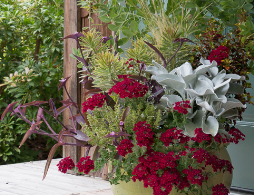
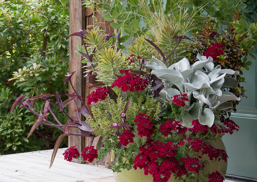
I went two very different directions with color in my garden this year. Near the house and on my patio, I imagined a dramatic combo of purple and red that I thought would make a moody and maybe even a slightly exotic feeling place, and out further in the garden I went with calming pastel colored plants and flowers that seemed like cheery but also relaxing mix that I could enjoy while weeding and picking vegetables.
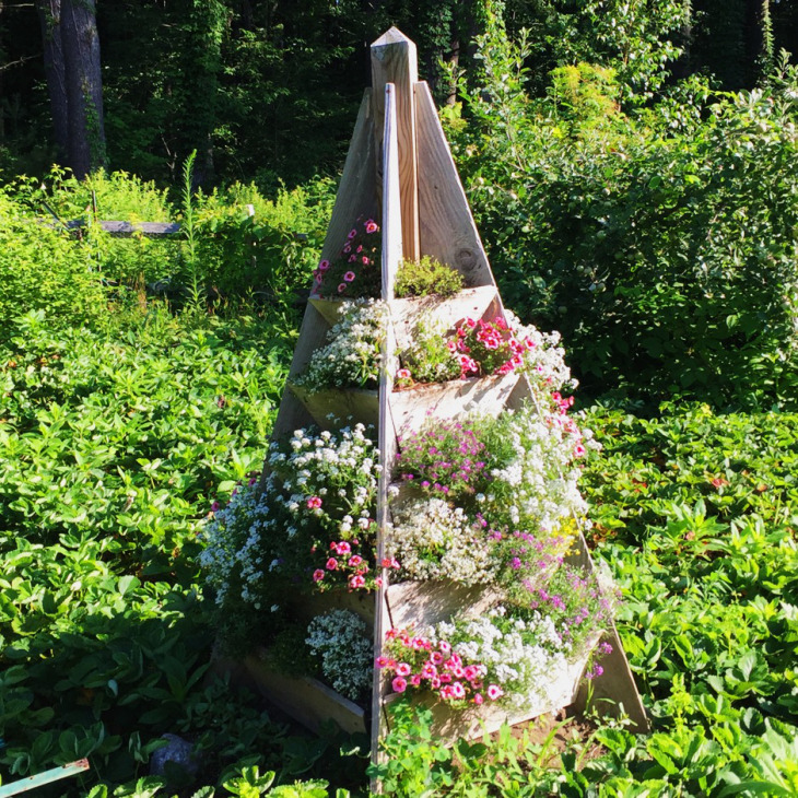
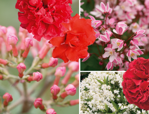
But I’ve decided I did it all wrong. The reds are starting to really annoy me (that is the thing about reds) and there is a fiery orange canna just about to bloom by my front door that I am finding so garish and eye-catching that I am half tempted to rip it out even before it has done its thing. For whatever reason, I am having an outsized emotional response to fiery color around my house this year and I think it will be many years before I choose red to greet me at the door again. Right now, I want nothing more than to move the plants I chose for the for the strawberry tower to surround me as I enjoy the patio. Next year right?
I’ve never been so affected by color in my garden before, normally I am just so happy that something is growing well and doing what it is meant to do. But maybe as a I grow as a designer, and I try to be more purposeful in my planning, the flip side is that the resulting intensity of the design suddenly has more impact on my feelings about it.
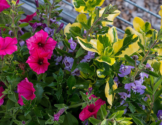
Pictured Above:
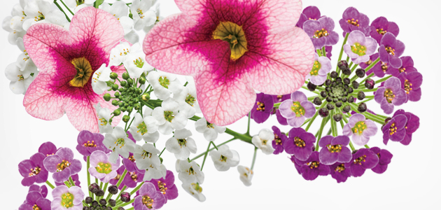
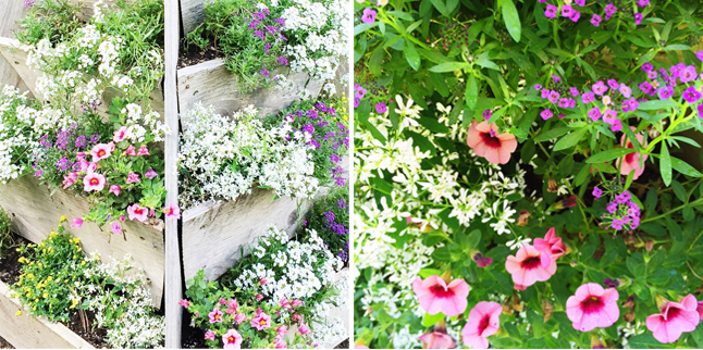
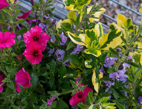
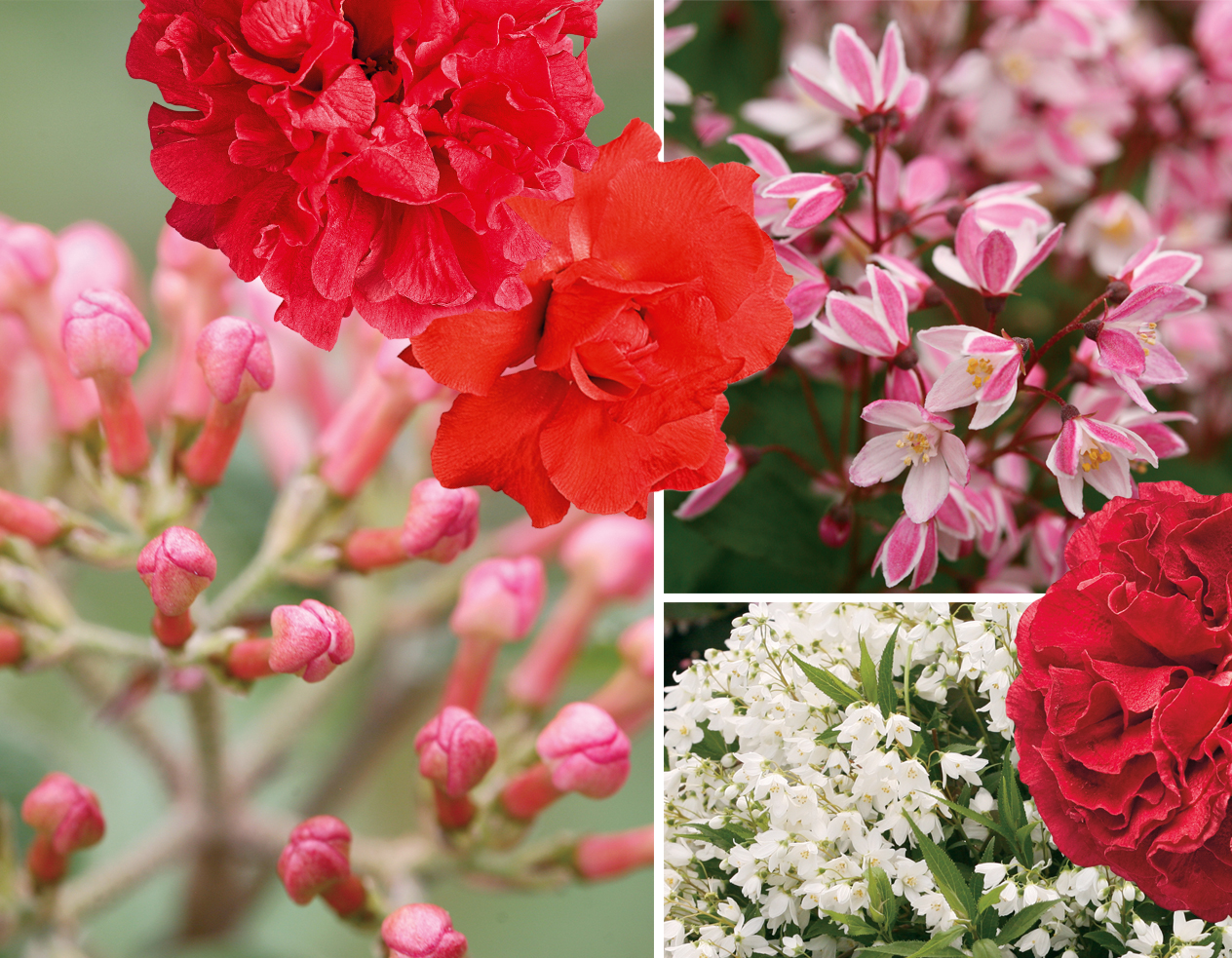
Calibrachoa ‘Strawberry Punch’ with its dark and light pink is much more appealing to me than red.
Alyssum ‘Snow Princess’ and Euphorbia ‘Diamond Frost’ provide a foil of little white flowers.
And Alyssum ‘Dark Knight’ and Mecardonia ‘GoldDust’ are interspersed to make the whole thing vibrant and cheery without being overwhelming.
I’ve decided that red is a much better color to plant far away as it will beckon me from a distance. The soft colors are hardly noticeable from the house (my veg garden – the home of the strawberry tower – is at the far side of my lawn and the farthest point from the door). I’m making plans to move all red things further away this fall – like a few azaleas and even the red twig dogwood in the hopes that I will love them more when they call to me saying come.. over here… look at me from a distance and feel the power of my beckoning call… rather than screaming at me every time I walk to the door.
Color is such a powerful design tool that I am not surprised I am having such a reaction. I will certainly be paying more attention to color theory and my own feelings about different combinations in the future. But I wonder, am I alone in this? Do you have any colors that you choose to avoid or are drawn to because of the way they make you feel?
Images: Rochelle Greayer